It strikes me with awe, how someone can leave an ever-lasting imprint on a place, by leaving behind a small, clever detail. The smaller the detail – the greater I find the impression – as it is usually the little things that we experience again and again, like a brass door handle shaped to grace the hand. What is to be designed need not be magnificent in size, but magnificent in action.
These feelings – of intimacy and belonging – come to me when passing by, observing, or handling, the creative work left by a man named Henrik Dutz. A young German architect; Henrik had worked at the studio for some three months, approximately half a year before I had returned to India. I had met him while attending a communal potluck dinner, hosted at an experimental housing community catered for the youth (the place was composed of a dozen shed-like individual housing units, arrayed irregularly within a dense pocket of shrubs and trees). I would describe Henrik, as one who conveyed a continuous calm demeanour, reminiscent of the head statues of Greek Stoics.
Although his commitment to the studio was short-lived, his little work has a remarkable level of refinement, practicality and beauty. These gems of Henrik are those of which that have left an everlasting impression upon me, and shall be discussed in depth.
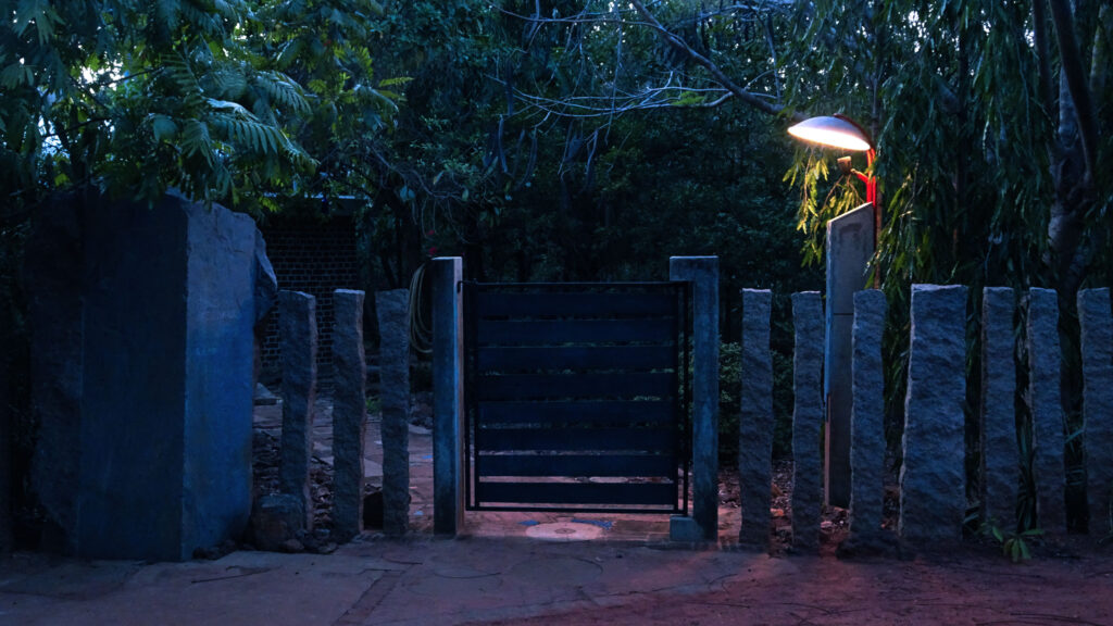
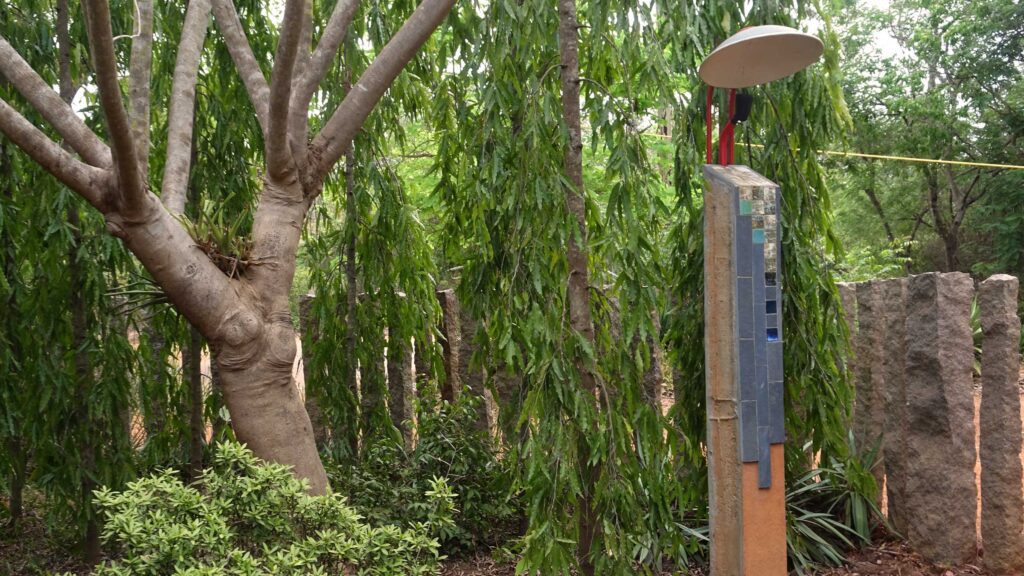
The first and my personal favourite of Henrik’s designs, is an outdoor light beside the front gate of the studio. Naturally, it’s power can only be truly appreciated during the night, while it’s serving its purpose. At a late hour, when I return to the studio to write like I am now; my small journey begins as I lift a latch, thereby releasing the steel gate so that I may enter. All the while, I am assisted by Henrik’s light; a comforting companion in the darkness, and of the darkness. Signalling either hello to me or goodbye with its warm glow.
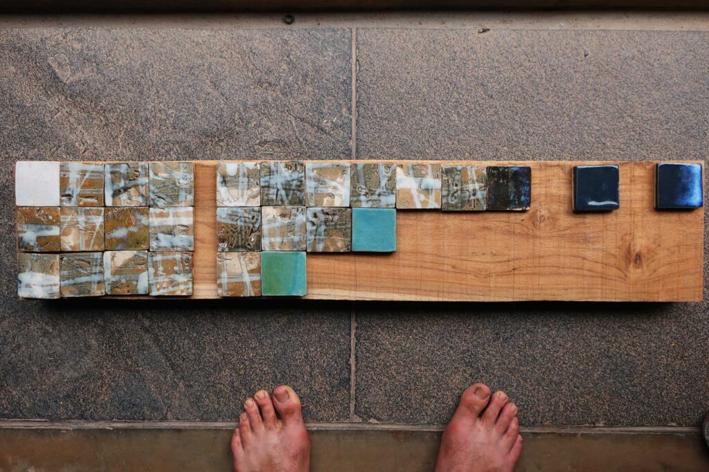
Henrik’s light is an assemblage of various leftover parts from local construction. Wastage, essentially. Its bulk is formed by a discarded concrete beam, stood upright, with its peak matching my very own height. It’s front surface – that which it primarily projects to the human world – is coated with a mud orange plaster, and is embellished with an assortment of leftover artisan tiles and river finish Cuddapah stone.1
29 • 1 • 2019
Sprouting from this concrete monolith are two steel tubes slightly arching to hold at a angle, a reflective dish aimed towards the gate and footpath. A third tube holds an LED light pointed upwards into the dish. The light then reflects to where it’s needed, so one never peers into the light source directly. From a certain perspective, Henrik’s light appears like a tall, robust man holding a small umbrella, delivering from it a pool of soft light to the earth below.
The second of Henrik’s work has a unique force of its own, a tension, formed in the flesh of steel. Its function is simple; a table frame designed to make reuse of an old, large wooden table top. This table frame is made from mild steel. But, there is nothing mild about it.
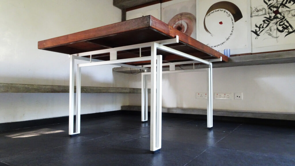
Many a times I have sat before this table for discussions, talking with the principal architect, various consultants, or both. One or two times I have admittedly stubbed my toe or rammed a knee on those ‘mild’ steel legs, and thus I am reminded of its power.
All the choices that were made to conceive this table; the size of the square hollow section, the weaving of parallel and perpendicular lines, the sleek proportions etc., formulate to make it perfect, to make it pucca pucca.2
The third and final of Henrik’s work to be described, is definitely his smallest yet most utilised. It is a counter-weight system for a communal kitchen door. It was created with a small brass pulley, an L-bracket, some string, and a plastic water bottle filled a third of the way. It’s nothing high-tech of course, nor expensive or difficult to make. In essence, it is the gesture that I find profound.
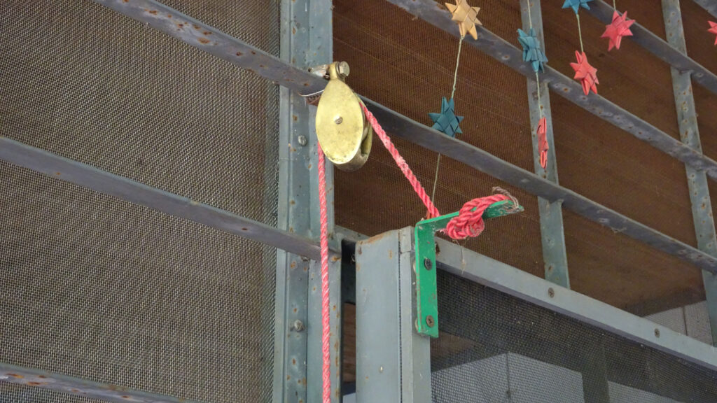
How often does one look to their surroundings, especially if it is shared, and asks themselves how they could improve upon it with minimum effort, but maximum usage. That door is opened manually easily over a hundred times a day, and each time it is closed automatically with Henrik’s counterweight system. This feature is a boon in this part of the world, where while opening doors, mosquitoes like to race with you inside.
14 • 05 • 2020
In my own professional work, I have yet to really grasp thinking in steel, as Henrik clearly demonstrates. The majority of my work so far has involved brick and concrete; from walls, to rafters, to a radical dome (more writing on this to come, eventually). So when I do gradually move towards creating details – particularly in metal – I look to these small works of Henrik’s for inspiration. Henrik exemplifies what one can do in quality, with so little; where each usage, transforms into an event.
1. Cuddapah is a black limestone, local to South India. A flooring material commonly used in Auroville. Those architects who dare, use it in river-finish (unpolished), which offers a delightful texture for ones feet.
2. Look to my previous blog post: In Pursuit of the Pucca Pucca, for an understanding of the word pucca.